As the idea for my folie was quite abstract, I found it hard to create a tangible design concept for this assignment. The folie had the intention of bringing people into the site and interacting and experiencing the bridge at a close scale. I had the intention of using this interaction as a way of activating the site. From this reflection I concluded that I wished to use people as activators of site for the next phase of the assignment. I started with this very linear design approach as an ongoing guide for the project.

Since establishing the design concept I decided to make it my aim for this presentation to come up with a solid reasoning process before coming up with a conceptual built form. I put a lot of thought into what I wanted to design at HSW, who I wanted to design it for, how I wanted it to look and what biomimicry process could infer this form and contribute to the whole scheme. I then came up with this mindmap which outlines all of these processes (biomimicry process, programme, contribution of site analysis, design concept/ metaphor and design tectonic) and how they interrelate with each other.
For example, the choice of creating a science centre/ astronomy observatory was to cater for the surrounding facilities, including the educational centres nearby (site analysis needed), to activate the site during the day and night (security) which led to the proposal of creating something adaptable (flexible between day and night) and interactive (educational) which highlights my view of sustainability becoming something multifunctional. The biomimicry process I have chosen (function, structure, interaction and properties of and between blood vessels) has informed the form of the building yet also links in with the notion of adaptable architecture as the level of blood at any one time and point in a vein restricts or enlarges the size of the structure. I have also looked at this process as a way to influence the building facade in the transfer of natural ventilation and light, metabolisation of waste and the capturing and storage of water as an important nutrient to keep within the context of the site.


The site analysis diagrams that I showed in the presentation were based on my research of the site and what I wanted to address in the project. In others words, I have only included relevant features of the site. The above diagram highlights the abandoned nature of the site as a junction between the elements and suburbs of the site creating a need to 'activate' the site.
The functional analysis conducted was important in looking at what the surrounding area caters to and what the site and the programme of the building could give to the users. I have decided to cater for the educational hubs and residential areas in creating an educational/ interactive building for these users.
From here it was vital to look at these immediate functions and the access from these to the site. The red lines show existing roads and pathways that can be utilised through walking, cycling, using public transport and driving (even though I do not wish to cater for vehicles in this proposal). The blue line shows an access that has the potential to be utilised as I believe that interacting with the rivers edge and creating links from the CBD to the site through following the river will be very important.
To encourage the use of public transport, walking and cycling and not relying on vehicular access I thought it was imporant in identifying these axes of transport and looking at what is needed to bring users into the site. I have proposed the insertion of a busstop at the top of the existing pathway down into the site and a ferry stop to not only bring awareness to the site for everyone who uses the ferry services, but for safe access to the site of a nighttime.

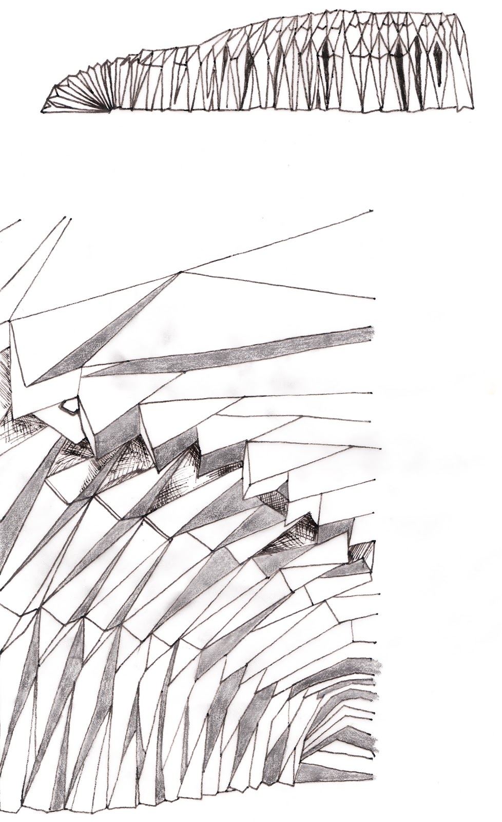
At this stage in the assignment, I have primarily looked at the building from a planning viewpoint. The plan of my building has stemmed from the research conducted on blood vessels as circulators in the body. The 'parti' design I came up with was to create a series of 'muscular' structures to the building with permeable layers and membranes on the outside of these with the purpose of changing the shape and form of the building and acting as natural filters. In this diagrammatic floor plan, the blue arrows show the deliberate movement of people forward into the space through the creation of 'nooks' as small gallery spaces as I found that veins push blood forward and prevent a backward motion through the use of valves. This movement is directed up through a spiral ramp system to the highest point of the building, an observatory level, this then curves around to enter a small cinema which serves as an educational tool and the roof can also translate into a mini planetarium. Users then move through the cinema to a straight ramp which acts as a mezzanine level to the gallery/ workshop/ gathering place on the other side and runs directly onto an outside landscaped area for nighttime projections (projected onto the building itself and the cliffs as well).

The research conducted on the functions and properties of blood vessels, although not explained very thoroughly in this presentation, can be seen in earlier blog posts. I did not want to create an extrememly literal approach of the operations BETWEEN the different elements of the circulatory system (the movement from the arteries to the arterioles, to the capillaries, venules, veins and heart again), I wanted to look at different scales and processes within this as design inspiration. As the planning was infered from the directive nature of blood through the body and utilising the metaphor of the 'heart' of the building as being the most desirable location in the space, I have looked at other design elements at a closer scale. The idea of capillaries are interesting in that they provide the transfer of nutrients between the arteries and veins and the body tissue. I wish for the facade of my building to act as a transporter of such elements however I need to further address the exact nature of what these facades will look like.


The above drawings were the result of all of the research and design process I have conducted so far in this assignment. This design is quite simple so far however I have already made the decision to use very simplistic and deliberate forms, materials and tectonics (Tadao Ando style...). Although you cannot see this decision just in plan form this is what I wish to look at in the next phase of the project. I realise that the absense of section and elevation results in a gap in design information but I really felt the need to spend a lot of time in the research, planning and explanation phase of the project before I commited to a clear facade and finalised form. These factors will be very deliberately designed and chosen.


So far, the project has become a big learning curve for me in learning and utilising computer programs. I have started on Google sketchup and the resulting form of the building has resulted (without a roof or facade detailing). This will be useful in visualising a 3D form and creating a connection between plan and section which is what I somtimes struggle with. However, this use of computer designing will not at all phase out the diagrammatic stage and handdrawn designs.
Another aspect of the design which I have mentally acknowledged, yet didnt look at too deeply in the presentation is tectonic. This is another element that I wish to design deliberately with the final result simplistic yet structurally beautiful. I thought that by creating a concrete design metaphor and conceptual design, the creation and depiction of such elements will become easier.
OVERALL REFLECTION
Since the completion of this phase of the project I have realised that it is so important to look at a presentation before submitting it a really think about what additional information needs to be included and how can the layout of the presentation help with effectively portraying an idea. Because so much of the design process is a mental or subconcious decision it is sometimes easy to make the mistake of confusing those you are presenting to because some of the information and processes youve used are not portrayed and still in your mind.
In terms of this design I think I have created a strong design metaphor and concept and now it is time to play with the scale of the building and in particular the facade and interactive nature of the building.
Things to look at: Using the movement of the building and the movement of the people through the building to generate electricity. This could then go another level and the building could sense when there are more people through pressure in the flooring which could then create electricity to move the structure and accomodate for this change in pedestrian levels. This notion of changing facades could then transcend into the idea that in winter the building could sense the change in temperature and the walls could thicken to provide insulation...??